5 ways to customize your squarespace website
So you’ve DIYed your Squarespace website but it’s feeling… blah.
Maybe it looks like every other Squarespace website, or maybe you’re just not sure how to incorporate your branding to it’s highest potential.
Or maybe it just feels plain ol’ boring.
There are plentyyyy of ways to take your Squarespace website beyond the template, elevate your design by incorporating more of your branding, and adding some SPICE, some FLAVOR, some FUN to it all.
Keep reading to discover five ways to customize your Squarespace website.
1. Add underline accents to headlines
A great way to add some dimension to headlines and make them pop is by adding an underlined element to them with one of your brand colours. This allows you to draw attention to specific headlines, or parts of headlines, that you want to stand out to your readers!
Below, you’ll find the code to copy into your CSS panel that will underline your headline anytime you put it in BOLD - this lets you highlight certain words alone or entire headlines, whatever you want!
All YOU have to do is change the hex code (#fec9fc) to a hex code from your brand colours! Now anytime you bold a part of your headline, it’ll get underlined!
PS, this method also means it won’t actually go BOLD, just underlined.
Copy + paste this code in your CSS settings to underline your headings!
// underline headlines
h1 strong, h2 strong, h3 strong, h4 strong {
text-transform:none;
font-weight:inherit;
background: linear-gradient(180deg,rgba(251,167,248,0) 50%, #fec9fc 50%);} /* change #fec9fc to a hex code of one of your brand colours */
Now, anytime you want a heading underlined, put in in bold!
2. Install a custom font
Adding a custom font is a simple way to take your Squarespace website beyond the template. And it’s actually pretty quick (with a little code - don’t worry, it’s mostly copy and paste) - let me show you!
Step 1 - Add the font to your Squarespace website
1 - COPY + PASTE
Start by copy + pasting the code below into your Custom CSS - you can find this under Design > Custom CSS
@font-face {font-family: ''; src: url('') format('opentype');}
2 - UPLOAD FILE
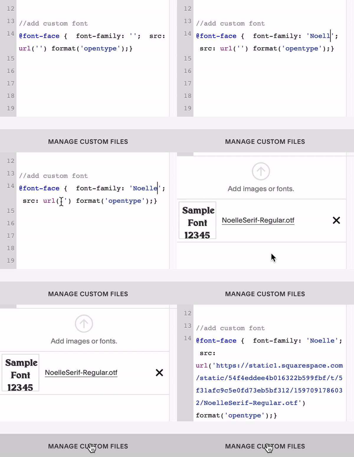
At the bottom of the CSS window, you’ll see ‘Manage Custom Files’. Click that and find your font file (the one that ends in “.otf”) to upload it.
3 - FILL IN QUOTATIONS
Fill in the first set of quotation marks (after “font-family:”) and name your font. It can be the actual font name or a shortened form or whatever you like, but it should be ONE word (hyphenated is fine)!
Next, Click between the second set of quotation marks in the “url('')” and then click on the file you uploaded and you should see the file name added in. It’ll look something like this!
@font-face { font-family: 'INSERT-NAME-HERE'; src: url('https://static1.squarespace.com/static/54f4eddee4b016322b599fbf/t/5f31afc9c5e0fd73eb5bf312/1597091786032/NoelleSerif-Regular.otf') format('opentype');}
Step 2 - Assign your font to specific text classes
You’re font is ready to use! But you’ll have to assign it to specific text classes to start seeing it on your website.
Here’s how to do it:
1. Copy + paste a code snippet below where you’d like to use your custom font.
2. Insert the name you assigned to the font in the previous step in between the quotation marks.
Note: this is not an exhaustive list of EVERY place you can use your font, but a list of more comment places you may want to use it!
HEADINGS:
// Heading 1
h1 {font-family: ’FONT-NAME’;}
// Heading 2
h2 {font-family: ’FONT-NAME’;}// Heading 3
h3 {font-family: ’FONT-NAME’;}// Heading 4 (only applicable for Squarespace 7.1)
h4 {font-family: ’FONT-NAME’;}
PARAGRAPHS:
// paragraphs
p {font-family: ’FONT-NAME’;}// large paragraphs (only applicable for Squarespace 7.1)
.sqsrte-large {font-family: ’FONT-NAME’;}// small paragraphs (only applicable for Squarespace 7.1)
.sqsrte-small {font-family: ’FONT-NAME’;}
Step 3 - Style your font
You’re done with code! Luckily you don’t have to choose your font settings in code. Head into Design > Site Styles to style font sizes, line heights, character spacing, colour - and all that!
If for whatever reason you need to style some items in code, here are some options for you!
h1 {
font-family: ’FONT-NAME’;
font-size: 18px; /* this will change the font size */
line-height: 1.6em; /* this changes the spacing between lines */
color: #ad5757; /* this changes the font color */
background-color: #ad5757; /* this changes background color */
letter-spacing: 5px; /* this changes spacing between characters */
}
You’re done!
3. Add background images strategically
Adding background images is a way to immediately increase the visual interest of your Squarespace website. But let’s try something a liiiiittle more interesting than just adding a branded photo as the background.
1. Use half-backgrounds to add dimension
Something that can easily start to happen with Squarespace websites is what Caroline from Wandering Aimfully coined the “Squarespace Bands of Doom” - basically that your site gets littered with alternating bands of colours/photos/sections that feel kinda boring.
How we can avoid these Bands of Doom is by adding in HALF backgrounds - this makes sections look like they overlap with each other and blend into each other, while adding visual interest to important parts of your site.
Here’s how it works:
Create a graphic (I like to use ADOBE XD) where the top half matches the background of your website and the bottom half uses an alternate brand colour.
These could be separated by a straight horizontal line or you could make it interesting by creating a wave, angling the line, or using a shape that aligns with your brand.
Now create a second one that is the inverse of it! The top should be the alternate brand colour and the bottom should match the background of your site.
Upload Graphic 1 as the background of section of your website, and then upload Graphic 2 as the background for the section right below!
Here’s an example from a recent client site!
Graphic 1
Graphic 2
And here’s how it looked when uploaded in stacked sections on their site!
Notice how the wave background overlaps with the text and the bottom newsletter block! So much more interesting than a solid blue background covering both sections.
2. Add brand elements as subtle background details
Another way I like to add visual interest to my website background is by including subtle branded details to my backgrounds.
Take a look at how it elevates this section of my website!
WITHOUT A BACKGROUND
WITH A BACKGROUND
Here’s how I did it:
Create a graphic that has similar proportions to the section you’ll want to add it to.
Match the background to the same colour as the background of your website
Add brand elements in soft/light brand colours. Like shapes or illustrations that align with your brand!
Export + add as the background image for the section.
4. Add some fun to your images
Are you just… uploading regular images to your website using image blocks? Let’s make them branded to add some fun and visual interest throughout your site!
Here’s how to do it:
First, open up an image you want to add to your website in Adobe XD or your design platform of choice (Canva Pro is an option but Adobe XD IS FREE. Yes - FREE.)
Now you have plenty of options to make it interesting…
Change the shape! Make it into a circle, an arch, a rectangle, an irregularly shaped blob even. The easiest way to do this on Adobe XD is by creating the shape first (use the shape tools to create a shape or the pen tool to make your own irregular shape) and then DRAG your image file from you Finder into the shape. It’ll automatically drop into the shape!
Add a border! Pick a brand accent colour and make it the border colour - thin or thick, you decide.
Layer it with branded icons or illustrated elements! Got floral illustrations as part of your branding? Layer it behind the photo.
Layer it with more photos! Create a little layered image stack by adding a few photos together.
Now all you have to do is make sure you elements are grouped together + export them with a transparent background (PNG format is best!).
Let’s see some examples:
5. Use image block layouts
One of my favourite ways to add fun design to Squarespace websites is by using the Image Block feature to incorporate dynamic brand elements all over my websites.
The image block has 6 display options: Inline, Overlap, Collage, Poster, Stack, Card.
Let’s get into some fun ways to use them around your website!
The Inline Image
An inline image is just a basic image without any bells whistles - but we can make them fun! I like to stack images, add borders, and include brand elements to elevate my images and really integrate them into my website (like I talked about in Customization #4!).
Here are some examples from my own site and some client sites! (I design all these as Transparent PNG’s on Adobe XD - which is free!)
The Overlap Image
The fun part of the overlap image is being able to overlap the title with your image with a background colour. I love the ability to overlap elements because it makes your website immediately feel a lot more custom.
Add an Image block to your page + switch it to Overlap
Head to your design settings + play around with overlap percentage + switch the background colour to match your brand and play well with the images you plan to add!
Add your image + text!
Check out the Overlap Image block in action!
See how we included an image that already added overlapped images + brand elements? Get creative with it!
The Collage Image
The Collage image block has to be my favourite one to use - especially when you want to call attention to important information (like your product offering!).
Add an image block and change it to Collage.
Add your image + text.
Head to your design settings + play around with the percentage your image fills and the percentage your card fills. My fave is when they overlap, so try something like 55% for both and see how that looks!
The Collage Image
Maybe call attention to your product!
And don’t forget you can choose to have the image on the right side or left side!
The Poster Image
The poster image basically makes the image the background for your text! I recommend using these for small text areas and not large ones because text can overflow when the page gets re-sized. So avoid that by doing as little text as possible.
Add an image block and change it to Poster.
Add your image + text (and button with a link too!). I recommend a simple image to make the text as readable as possible.
Head to your design settings and adjust any overlays and fonts!
Poster Image
The Card Image
Ok if there are favourites, there are least favourites - and this is the card image block for me. I wish the image would re-size to fit the whole height of the image card because then I’d love it!
To avoid odd gaps, I recommend using this one with images that have transparent images like the example below!
Card Image Block
Fusce dapibus, tellus ac cursus commodo, tortor mauris condimentum nibh, ut fermentum massa justo sit amet risus. Maecenas sed diam eget risus varius blandit sit amet non magna.
Those are all the tips I’ve got for ya today! Hope they helped add some fun + flair to your website 🎉


